Robyn Lynch unpacks her recent AW23 collection
“This season was an opportunity for Robyn Lynch to look within and explore what it means – and looks – to be Irish,” the press release began at the Robyn Lynch AW23 show during last weekend’s London Fashion Week.
The Dublin-born designer, now based in east London, delivered a collection that dissected the nuances of Irish culture and its subcultures, picking apart the loveable staples of the region spanning the green hues associated with the country, as well as the Irish symbols that are recognisable to the wider world. As Lynch tells HUNGER, it was a chance to look back on the original purpose of her eponymous brand, and to question what it set out to do back in the designer’s days presenting under Fashion East.
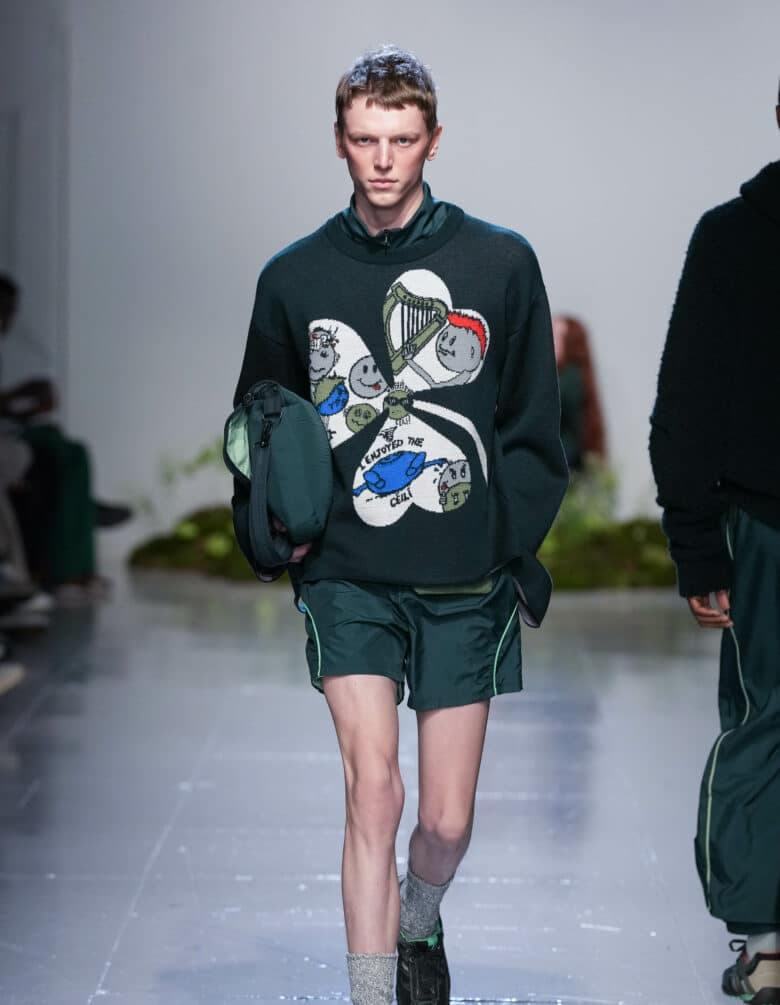
As one of the Woolmark Prize finalists, Lynch was tasked with the theme of ‘Dialogue’. “Her own interpretation hones in on stereotypes as forms of communication and the numerous associations her identity garners with others – without as much as uttering a word,” the press release stated. “‘I Googled ‘Irish T-shirt’ and what came out were a bunch of green, leprechauns, shamrocks, pints of Guinness and harps’,” says Robyn. But instead of trying to prove the stereotypes wrong, she leaned into the iconography by turning those Irish-isms on their head and presenting them as symbols of pride’.”
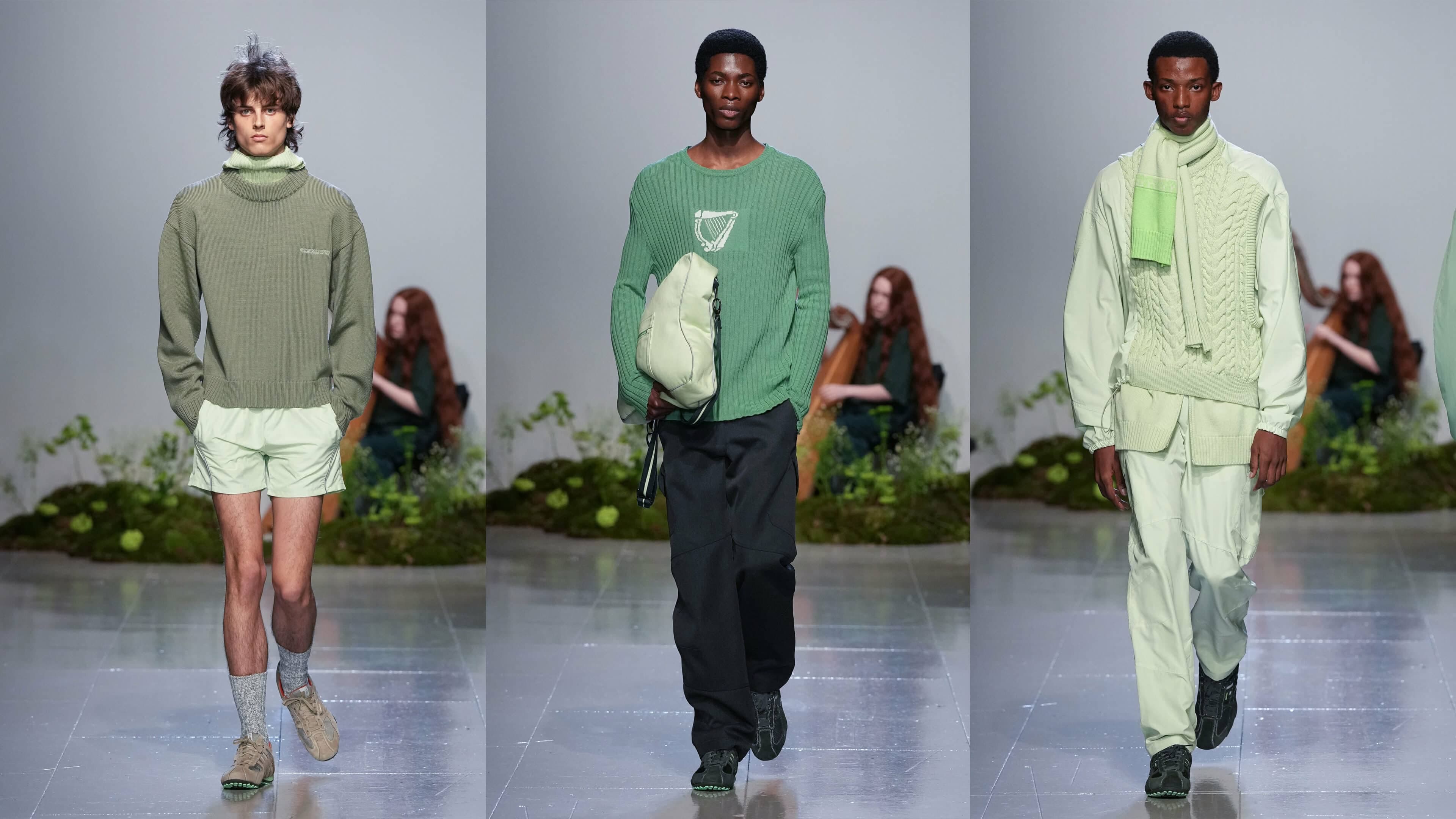
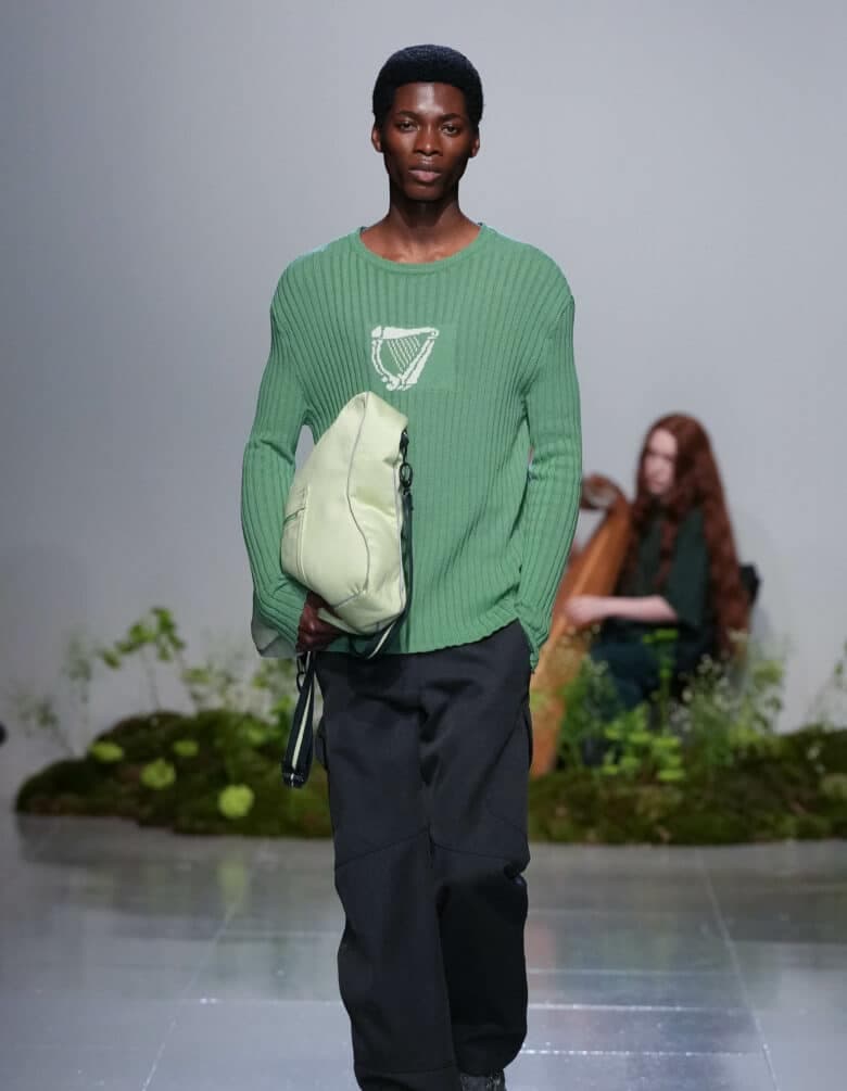
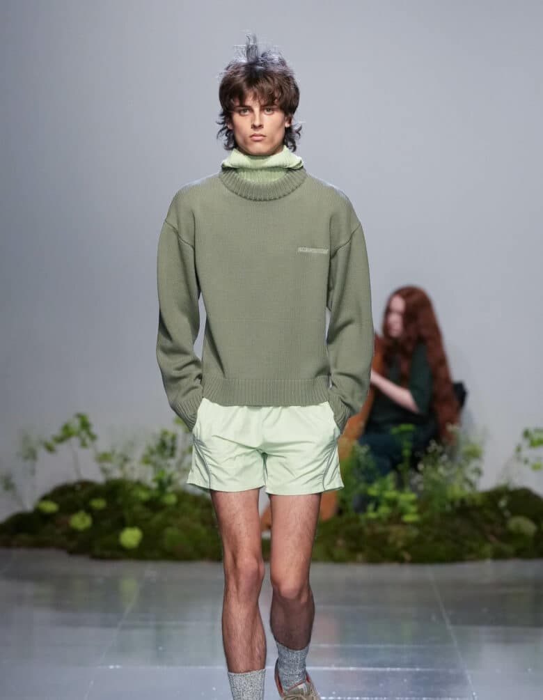
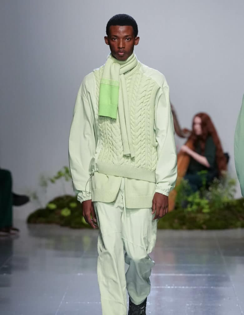
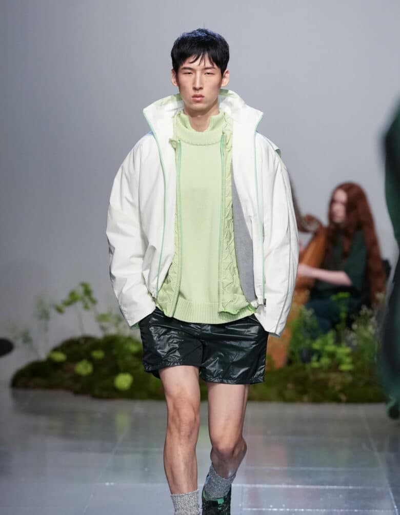
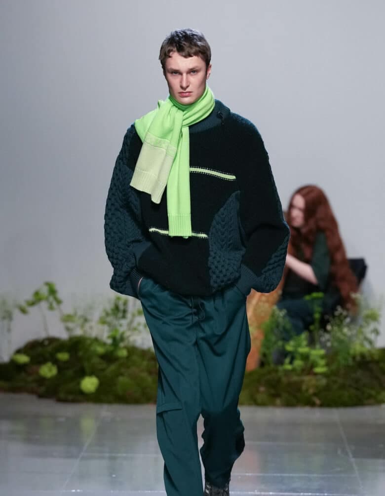
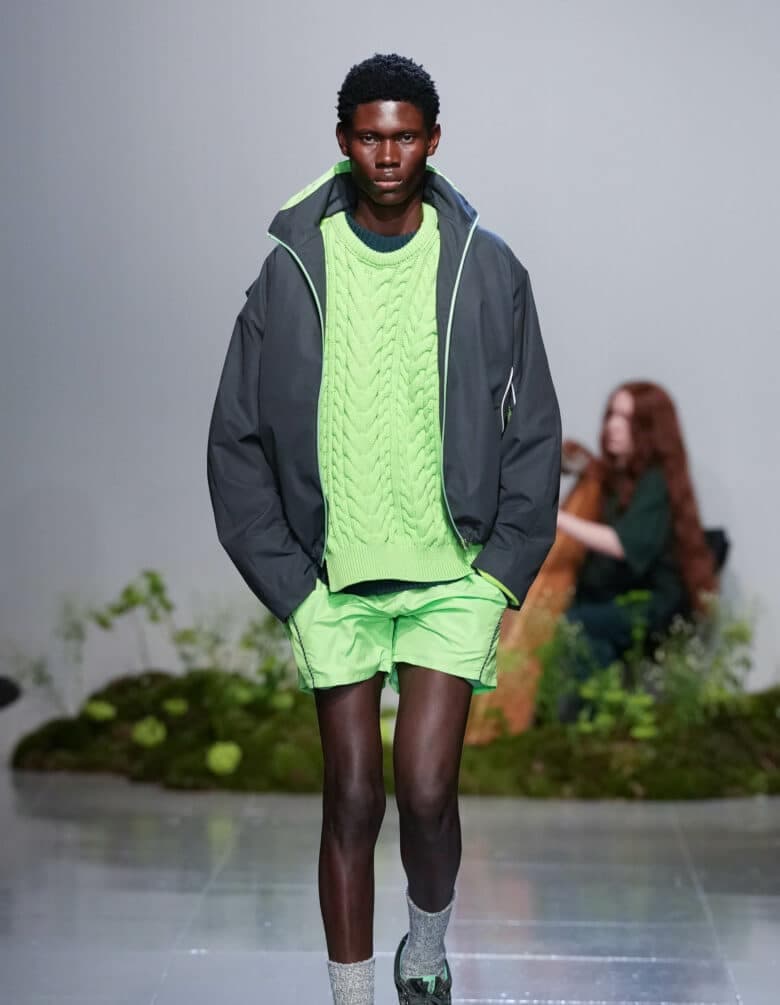
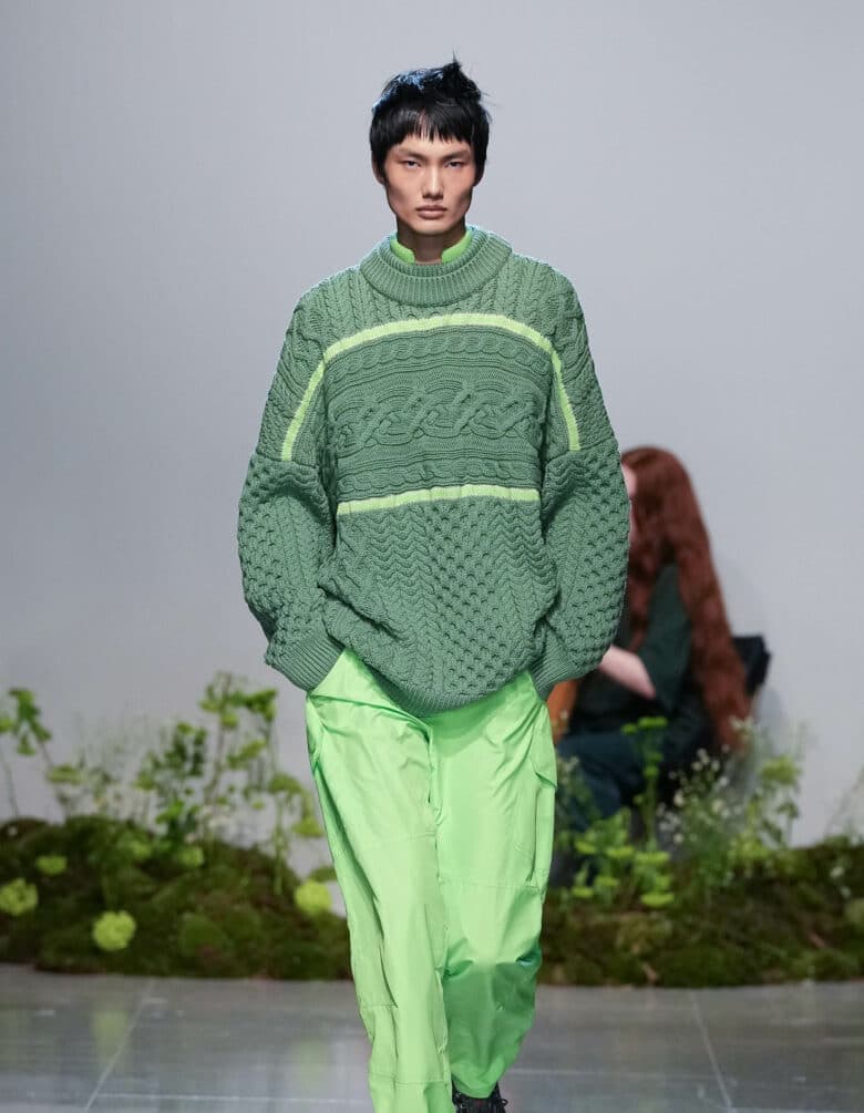
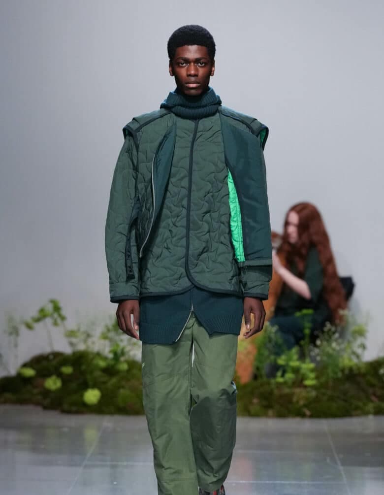
What followed was a spectrum of green; pale pistachio, lizard green, deep sage and phthalo green – a gradient brush stroke of the country’s colour. Lynch’s Aran knit was modernised again in places by fusing the traditional technique with elasticated toggles and pulling inspiration from cycling jackets. A long sleeve Key West yarn that feels vintage to the touch was adorned by a subtle harp image, an allusion to the Guinness logo. Then there was another nod to her father, using Geox shoes (his favourite shoes) from 2003, found on eBay and then hand-painted.
Nothing felt too kitsch or cliché – a potential concern for anything that’s inspired by a country’s products. Instead, the collection was a projection of nostalgia, memory, and actual wearability, with little winks to the segments of the country that only some people might get, creating varying levels of resonance rooted in Irish culture.
HUNGER sat down with the designer to find out more about her AW23 collection…
What was the starting point of the collection? Did the process begin with a particular colour, material or technique?
I look at the collections in quite a narrative way. I like to build a fun story, take a topic and stretch that out and make fun references along the way. I’m part of the international Woolmark Prize finalists and they gave us a theme to work around for the collection called ‘Dialogue’ and we had the option to either integrate that into our main line or else make a capsule collection completely on its own. I really wanted to make the best possible collection by pooling all my resource resources together into one. I never really work in a really deep way or set myself a specific theme to then work towards.
I started to think about what I wanted the brand to say? And what do I want the brand to represent? I looked back at the very beginning of the first seasons with Fashion East and I wanted to represent Ireland in a way that I don’t think was done when I was growing up and I was in university. There were so many subcultural brands out there that represent British culture, that represented so many different things. I felt like Ireland had such a great alumni of womenswear designers that did that, but for the menswear market it felt like there was something missing.
And so how did that translate into the collection?
I wanted to do like a tongue in cheek version of this and took the tackiest things that you can think of when you think of Ireland. We went on to American eBay and found the tackiest St. Patrick’s Day T-shirt in every single shade of green, holographics with shamrocks and leprechaun and harps and everything, and then just tried to take the tackiest elements and flip it on its head. Almost like a trendy souvenir shop. I wanted the whole collection to be green, but instead of an emerald green, I tried to do a deep dive into four beautiful colours that took a while to dye and mix. We landed on our four shades of the pale pistachio, the sage, the dark forest green, and the bright neon green. I tried to take those funny references that would only if you know you know…
That definitely comes through. But rather than exaggerating specific branding in a kitschy almost pop-like way, it felt more like nostalgia?
I think I always try to get that, but I think that comes through in the silhouette, from looking back at that boxier and cropped fit silhouette that was around in the nineties and maybe that’s why I reference my dad so much. When I was at university and we started to do research, I didn’t love going to the library, you know, looking at different types of things and researching. I found it much more enjoyable to sit around my auntie’s house with a box of photographs and get real life stories and real life inspiration.
With your harp-detailed long sleeve specifically, how do you know not to push something too far and not dive too deep into big, bold branding that’s instantly recognisable?
There’s like a fine line that I know in my head not to cross. I know when to stop and then hold it back. So we did that logo and then I was going to add some text to it and we did a few mock-ups and I was like, ‘no, it’s enough’. I think it’s almost not about knowing what to do, it’s knowing when to stop. I think that’s the really key thing.
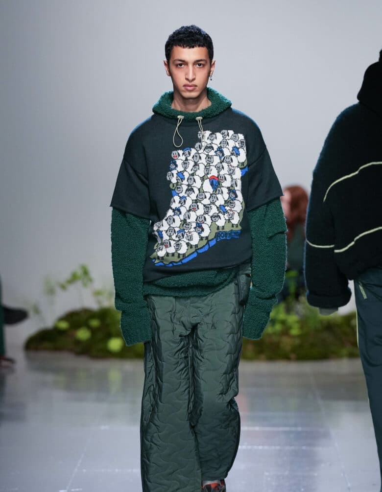
I also thought the Aran knit jumper/jacket was interesting, really merging two worlds together.
So we’ve been doing that again since AW19. I haven’t done one since because my factory at the time didn’t understand what I was trying to do. We had so many problems with production because they were just looking at this jacket, and I’d sent them the pattern and they were like, ‘what the hell is this?’ I obviously have a much better relationship with my factory and they trust me and I go over there and back and forth. One reason in particular it’s one of my favourite ones is because it’s taking this jumper that has such association with traditional tourist gift shops and introducing it to a customer who would never normally buy a jumper like that.
Well that sounds like what you’re doing in a nutshell; taking traditional aspects and pieces and then reimagining them for the contemporary wearer.
Exactly. It’s trying to have that cultural appreciation for all these old techniques, but making it relevant to nowadays.
How do you think people would view your clothes if you were to show to audiences in Ireland rather than London?
I just don’t think that the infrastructure is here to even get this far that I’ve got fortunately, which is a double-ended source. Because obviously I absolutely love London and I can’t really see myself moving back anytime soon at all. But with Ireland, I think it’s just not got the traction in Ireland to do it. With that being said, this time at the show, we had such amazing Irish talent and support that came over. And for them to come over and make a bit of a thing about it and have that representation in a different country almost makes you feel… I don’t know about you, but do you ever leave your country and feel 10 times more patriotic? I don’t know if it would’ve been the same if I was doing it to Ireland, because everyone has their references. Everyone gets it. Everyone probably has a Guinness top at home, but when you come to London, it feels a bit more of a world stage. So it makes it more special.